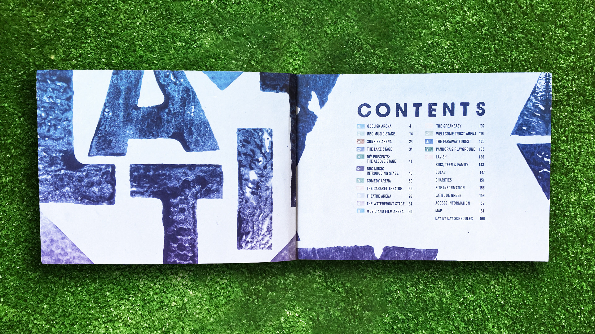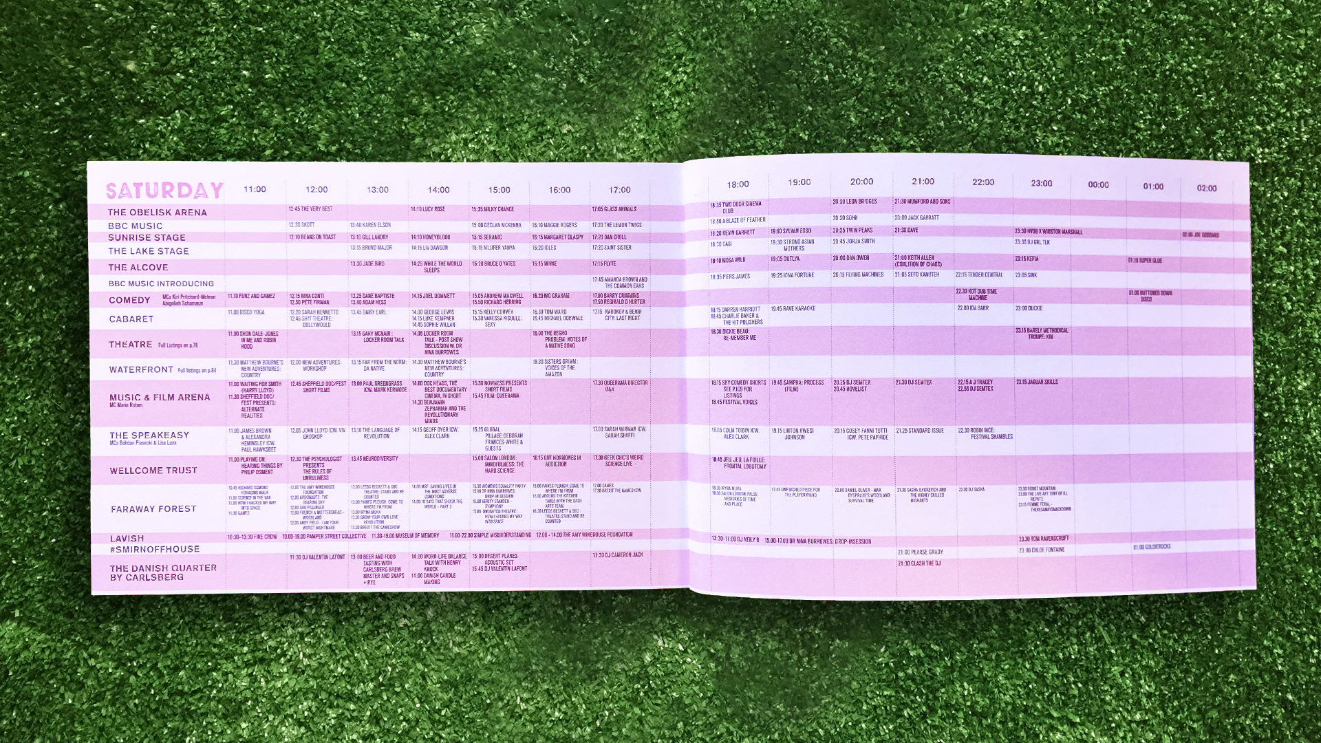

The festival programme was drastically reduced in size this year almost halving the programme in both size and page number. The reason for doing this was to create a more useable guide for the customer, this also included colour coding and creating icons for each stage.
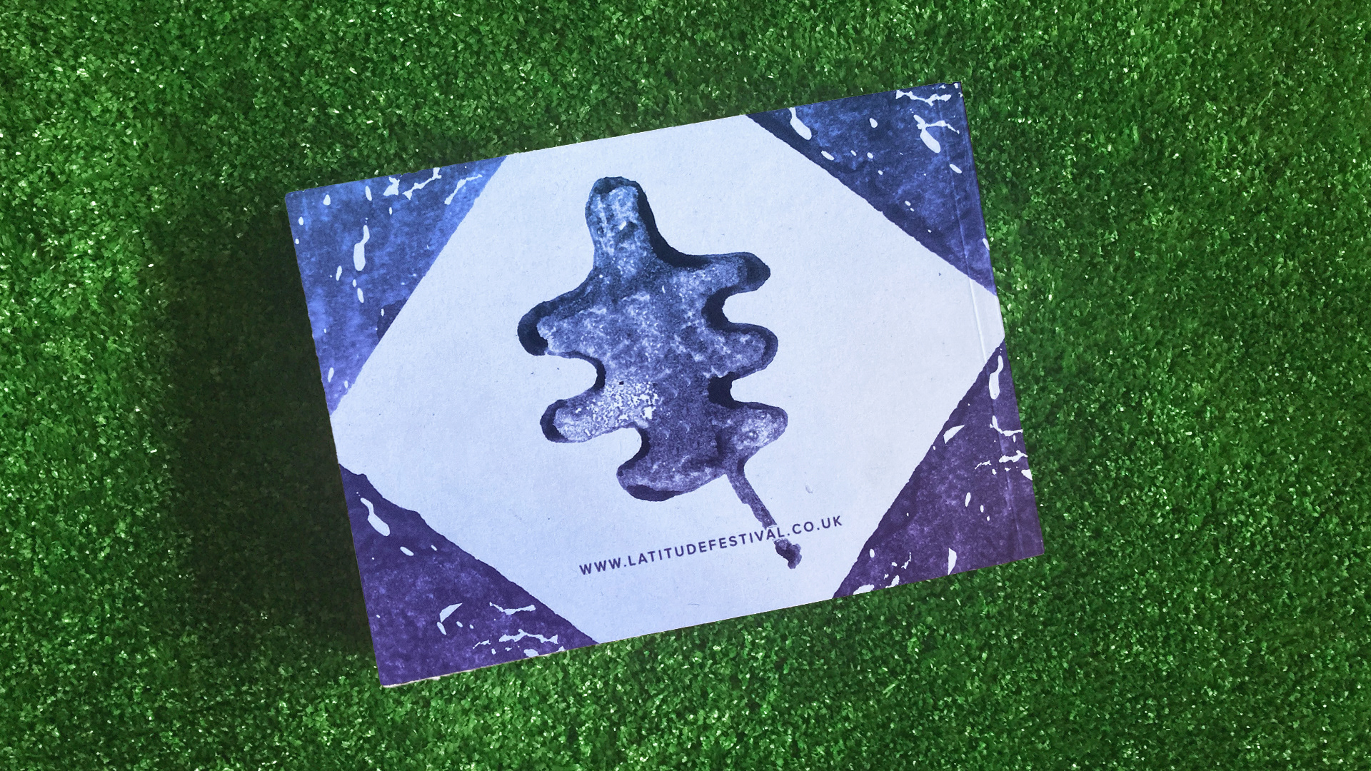
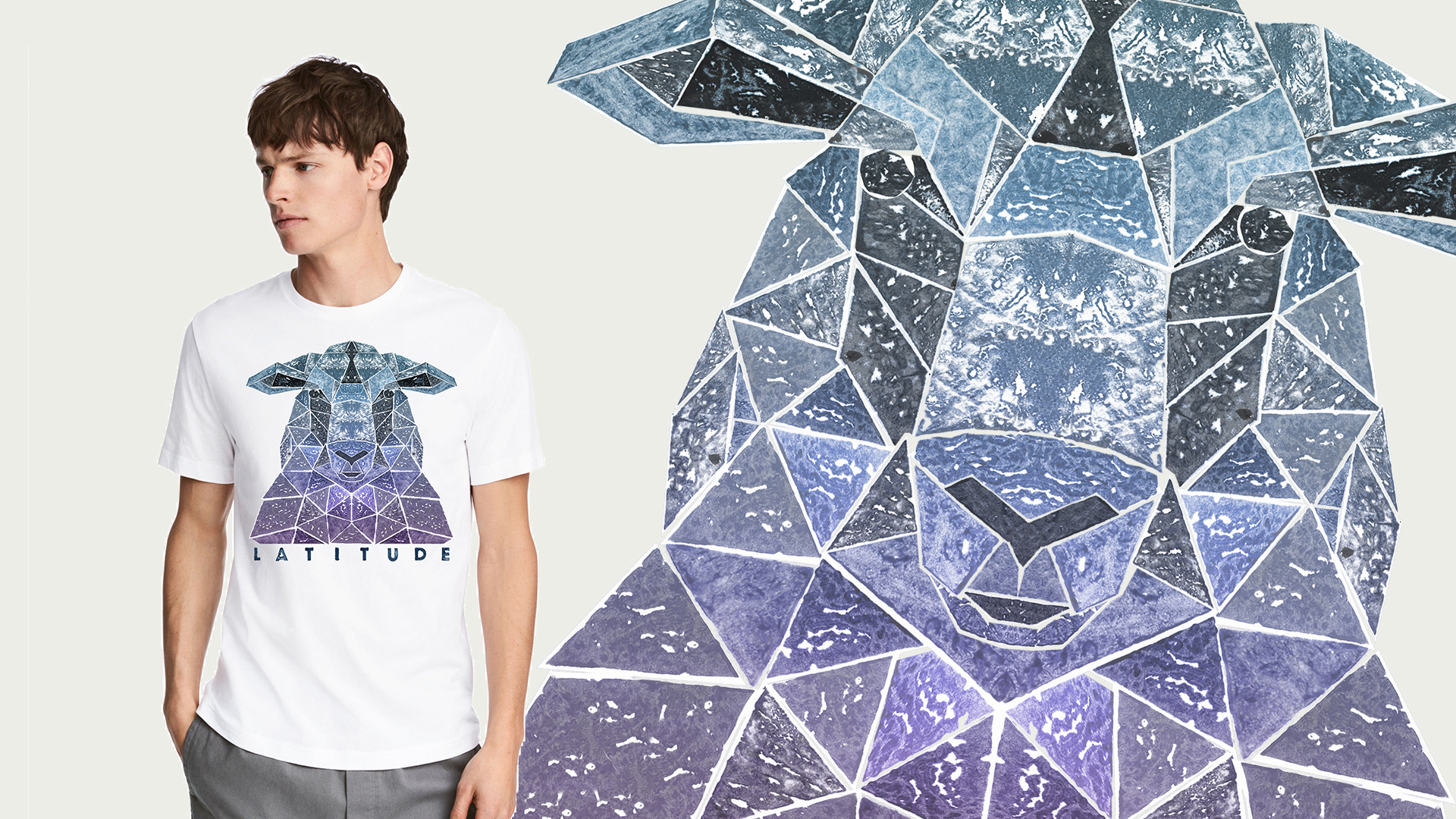
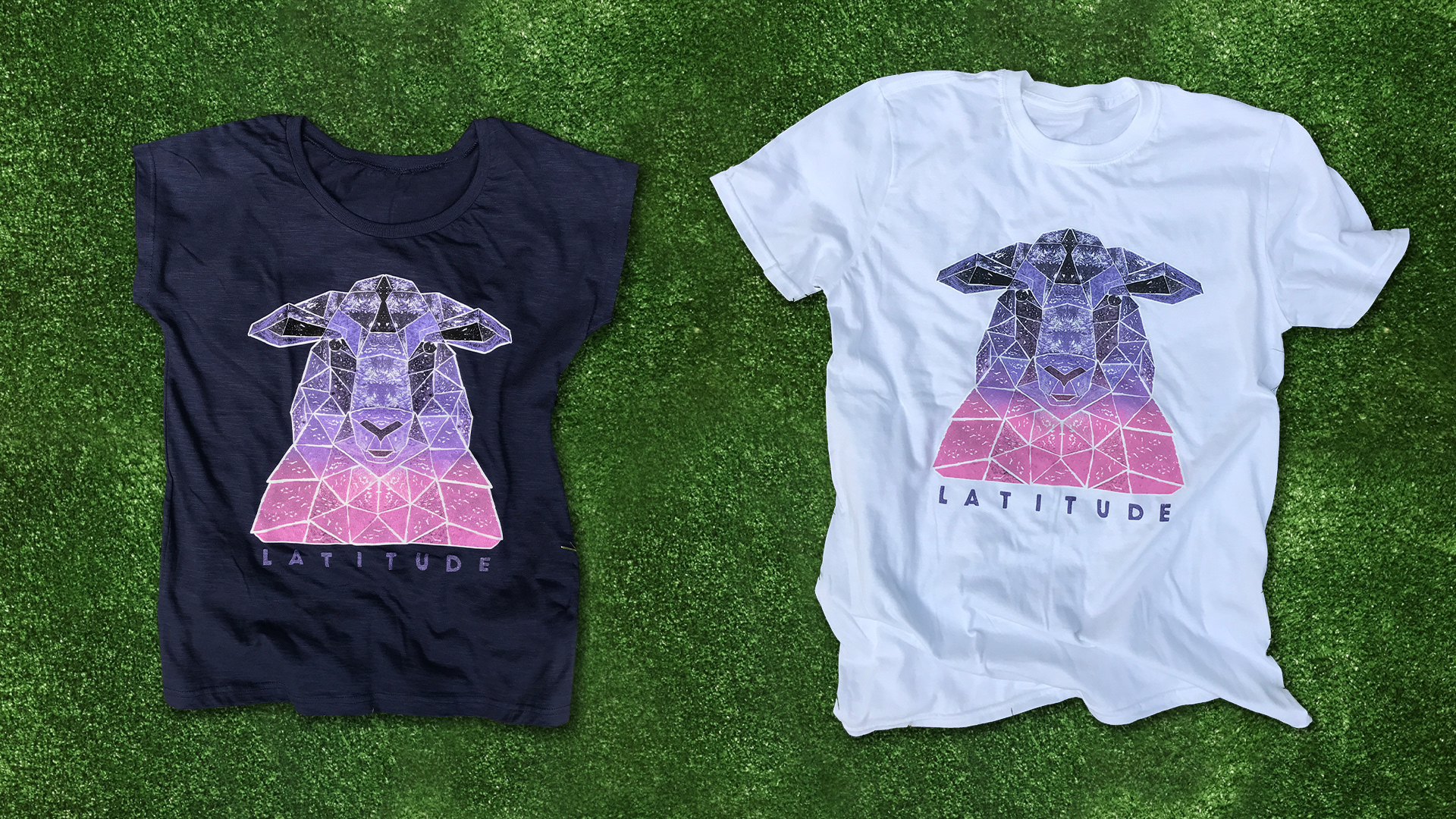
Potato prints were used across both the programme and merchandise as we wanted to give the design a natural, organic feel. By using this printing method we came up with some interesting textures which could then be carried across the whole campaign, tying the garments and programme together.